Gertrudes
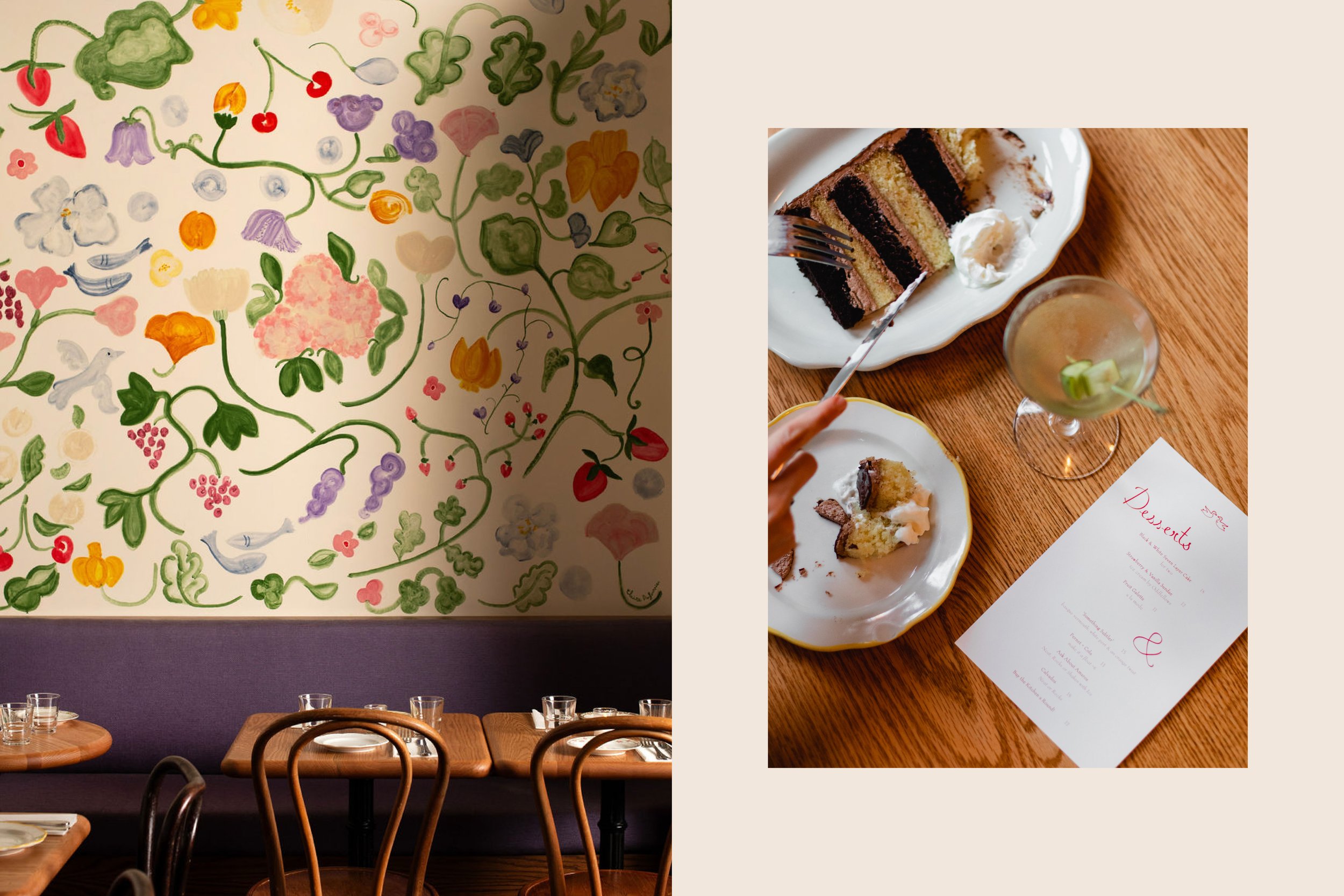
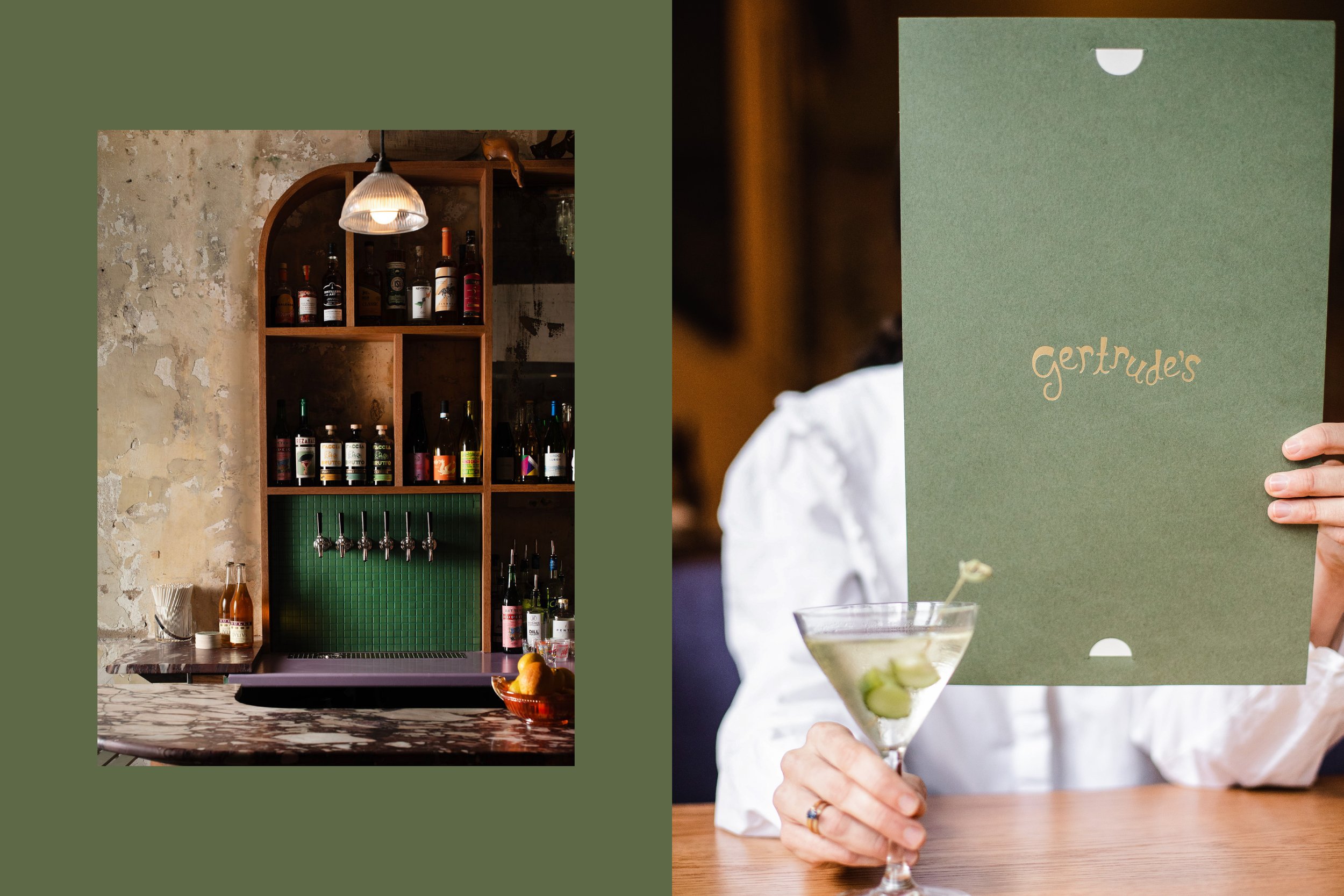
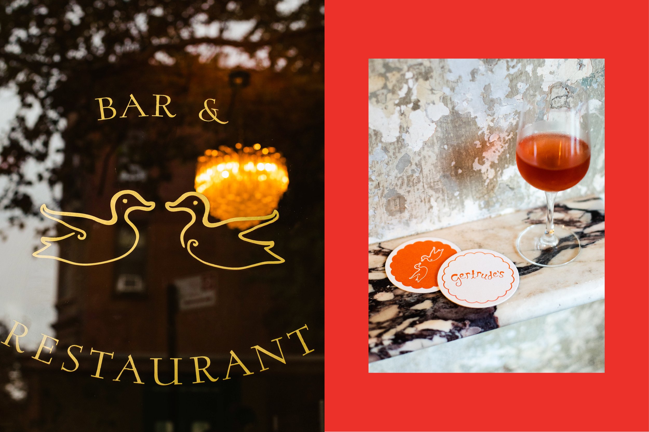
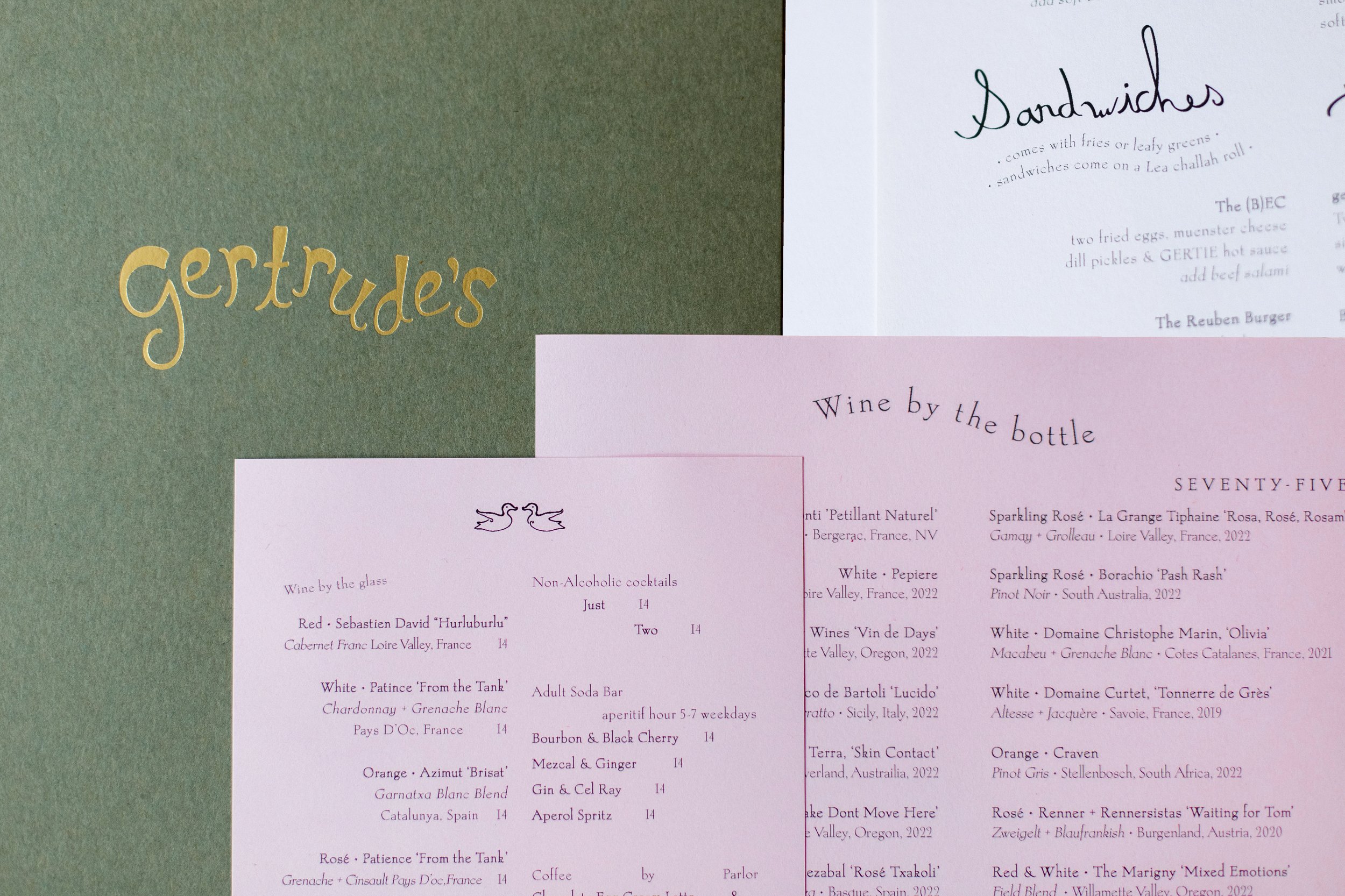
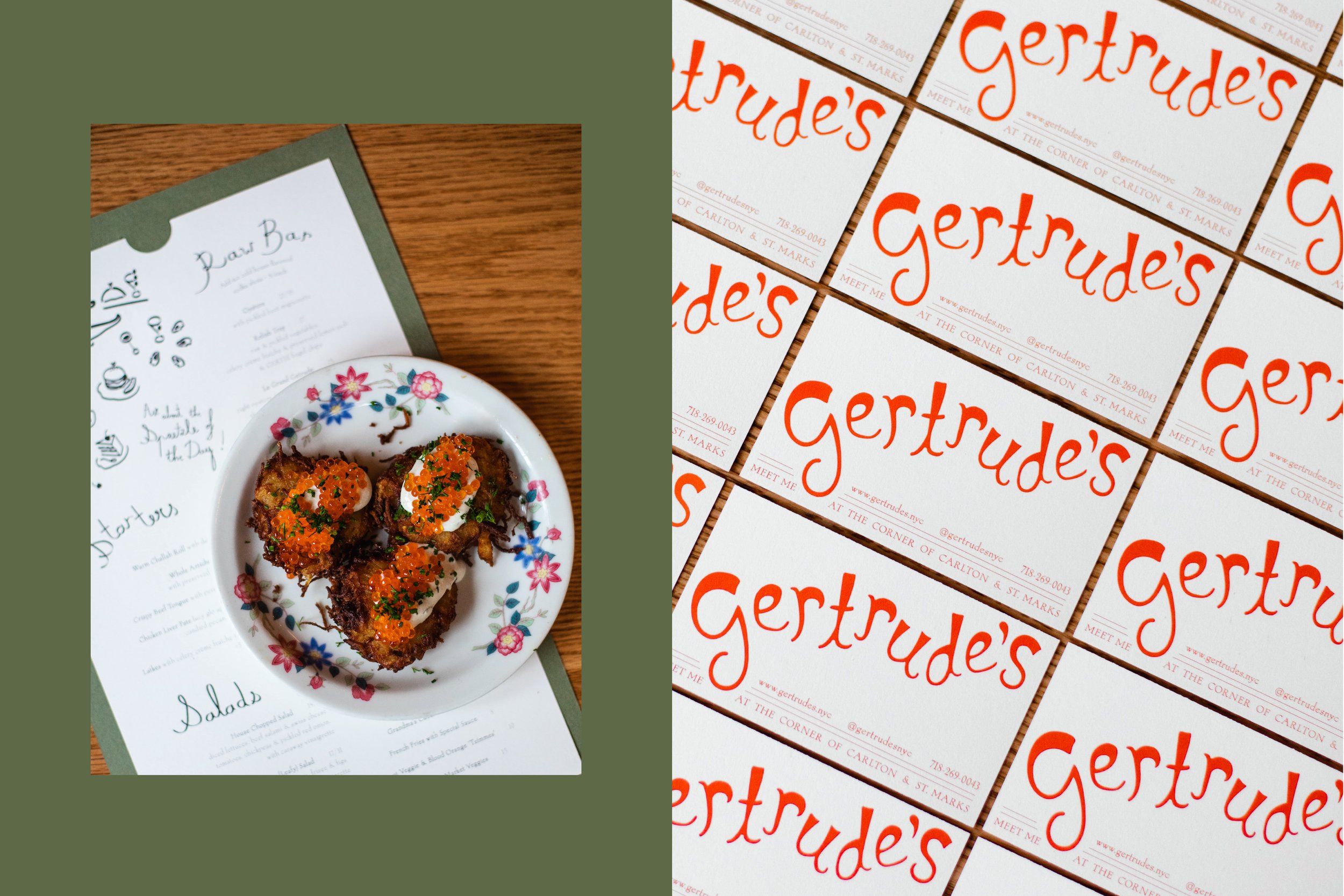
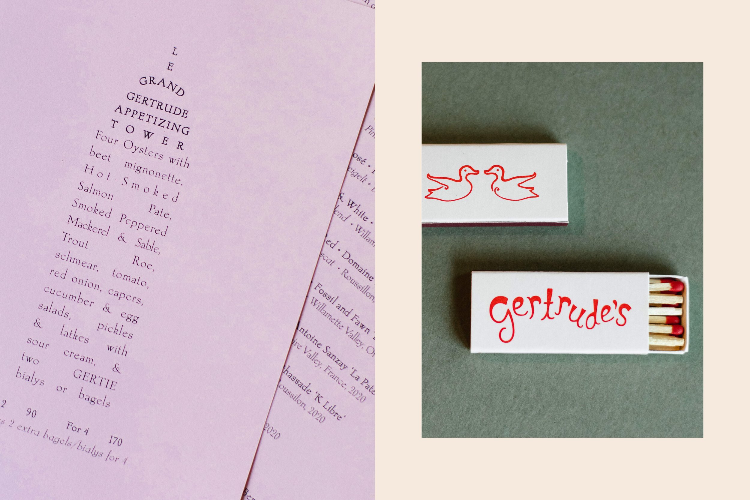
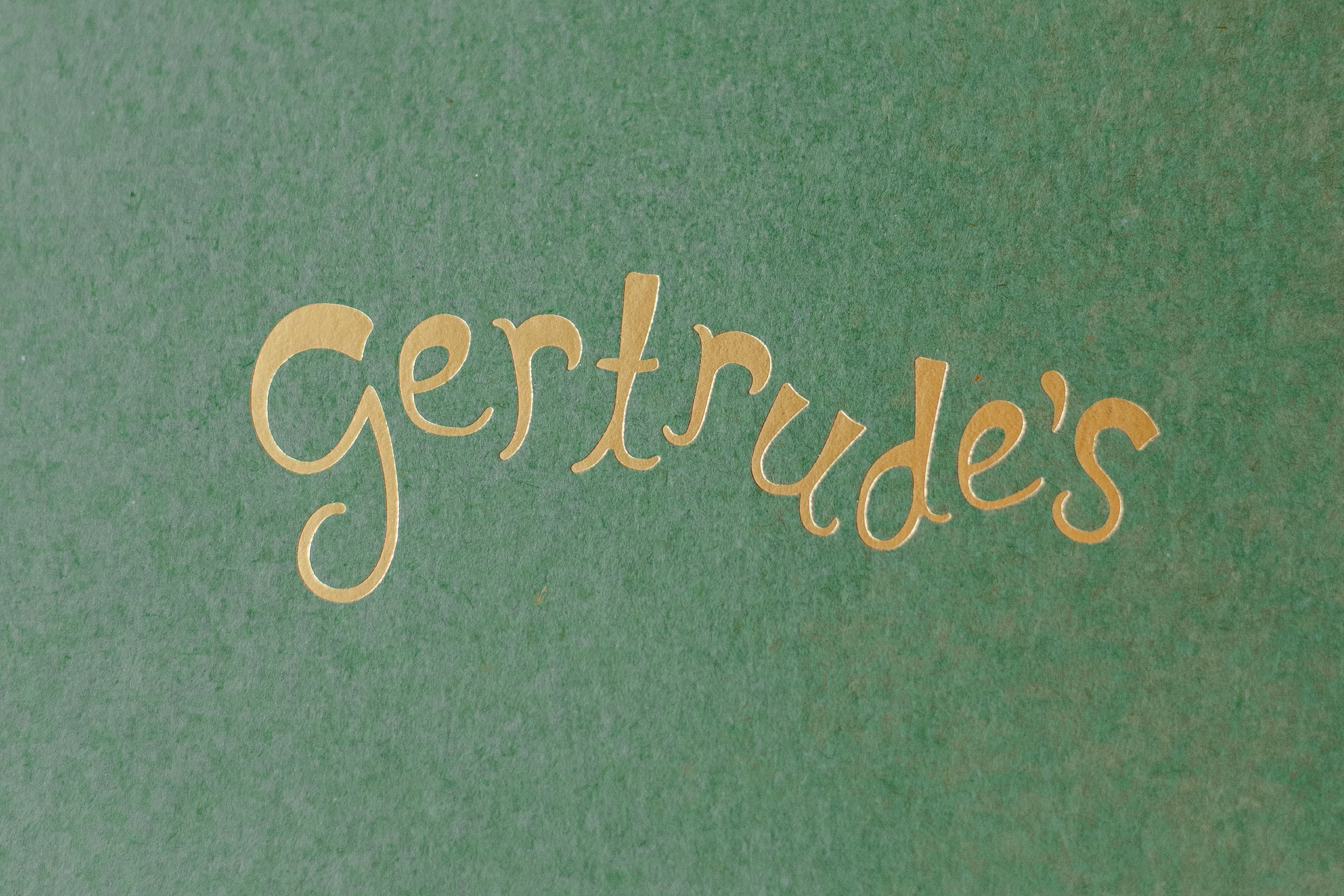
The visual identity of Gertrude’s is inspired by the 1930s, a decade that left its mark as the Great Depression in the United States and the tail end of "Les Années Folles" - the crazy years - in Paris. Despite the prevailing economic hardships, Paris reclaimed its status as the epicenter of the arts, where surrealism, jazz, cubism, and more thrived. For those immersed in creative pursuits, it was, as Ernest Hemingway so aptly put it, "A moveable feast." In this creative direction, we draw a parallel between Gertrude (the woman)’s birth era and appreciation for glamour and music, Gertrude (the restaurant)’s french inspiration and its desire to be a gathering place for the community. In terms of graphics, we look at 1930’s restaurant and lifestyle branding inspirations, and are inspired by an analog touch, handcrafted typography - embracing its inherent imperfections -, whimsical illustrations, and warm, neutral papers, adorned with vibrant splashes of color.
Creative Direction: Polonsky & Friends
Logo Design: Manolya Altan
Graphic Design: Sharon Chen, Claire Dufournier and Sara Steege
Illustrations: Claire Dufournier
Photography: Pauline Chatelan
