Rio
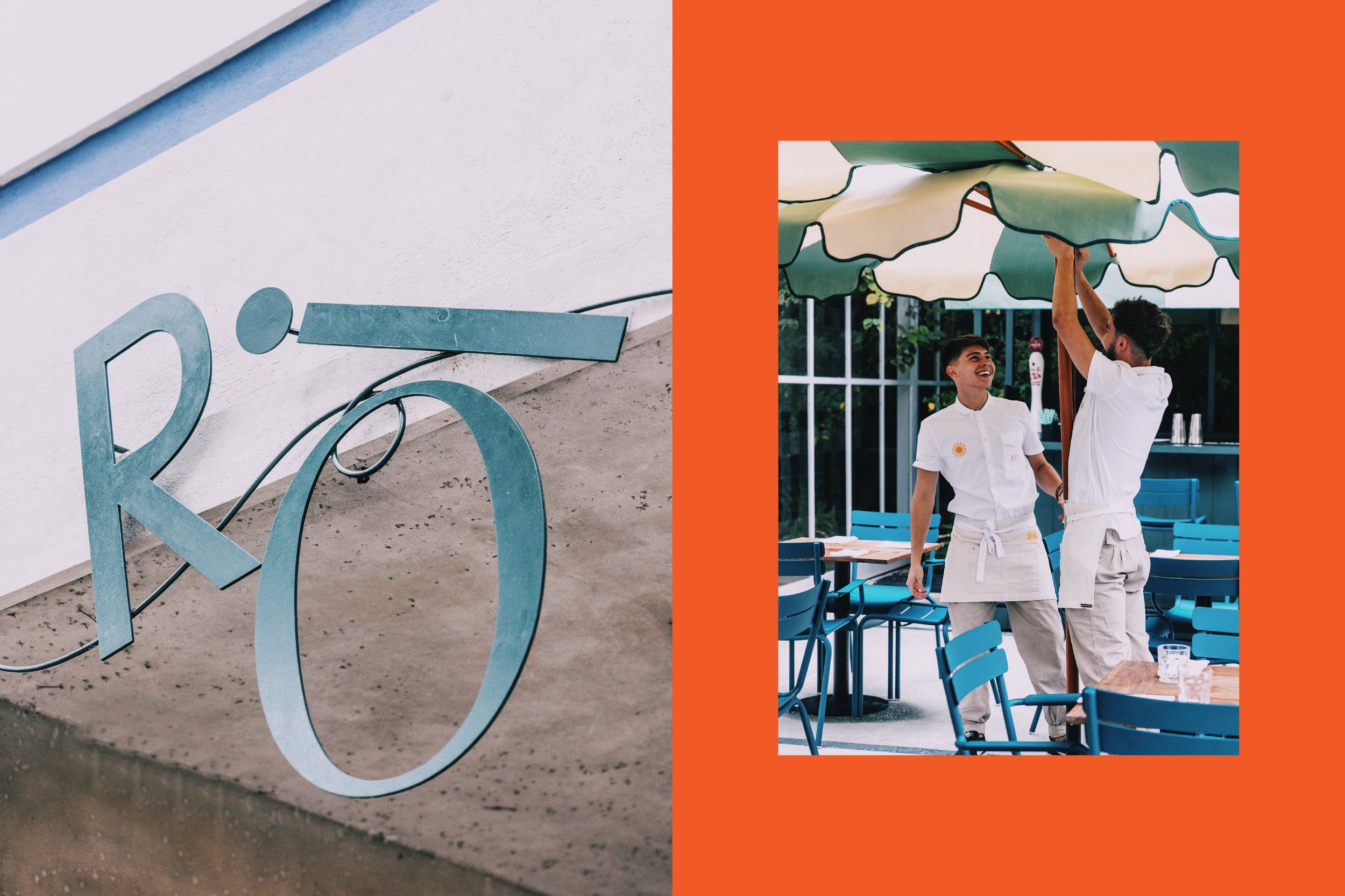
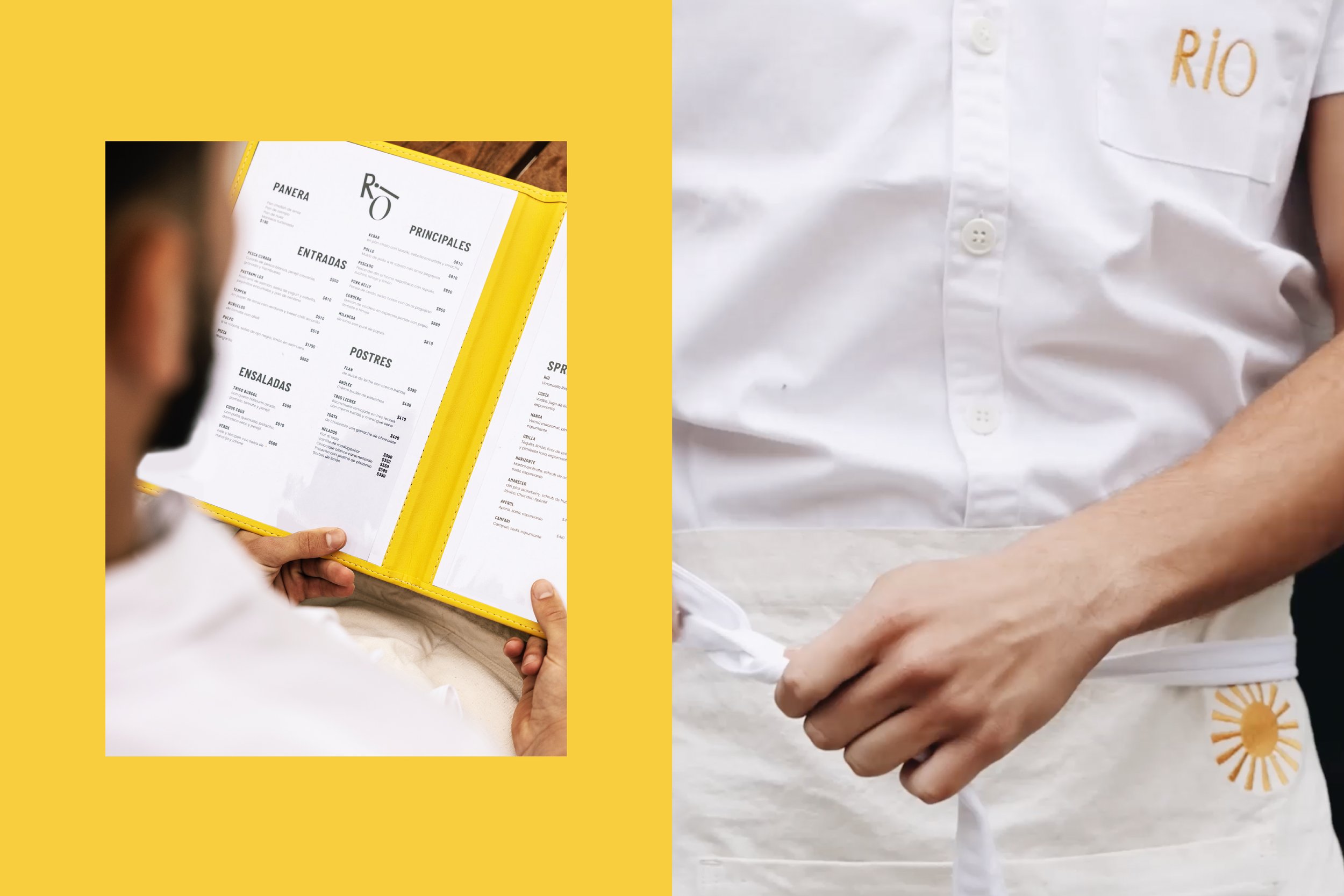
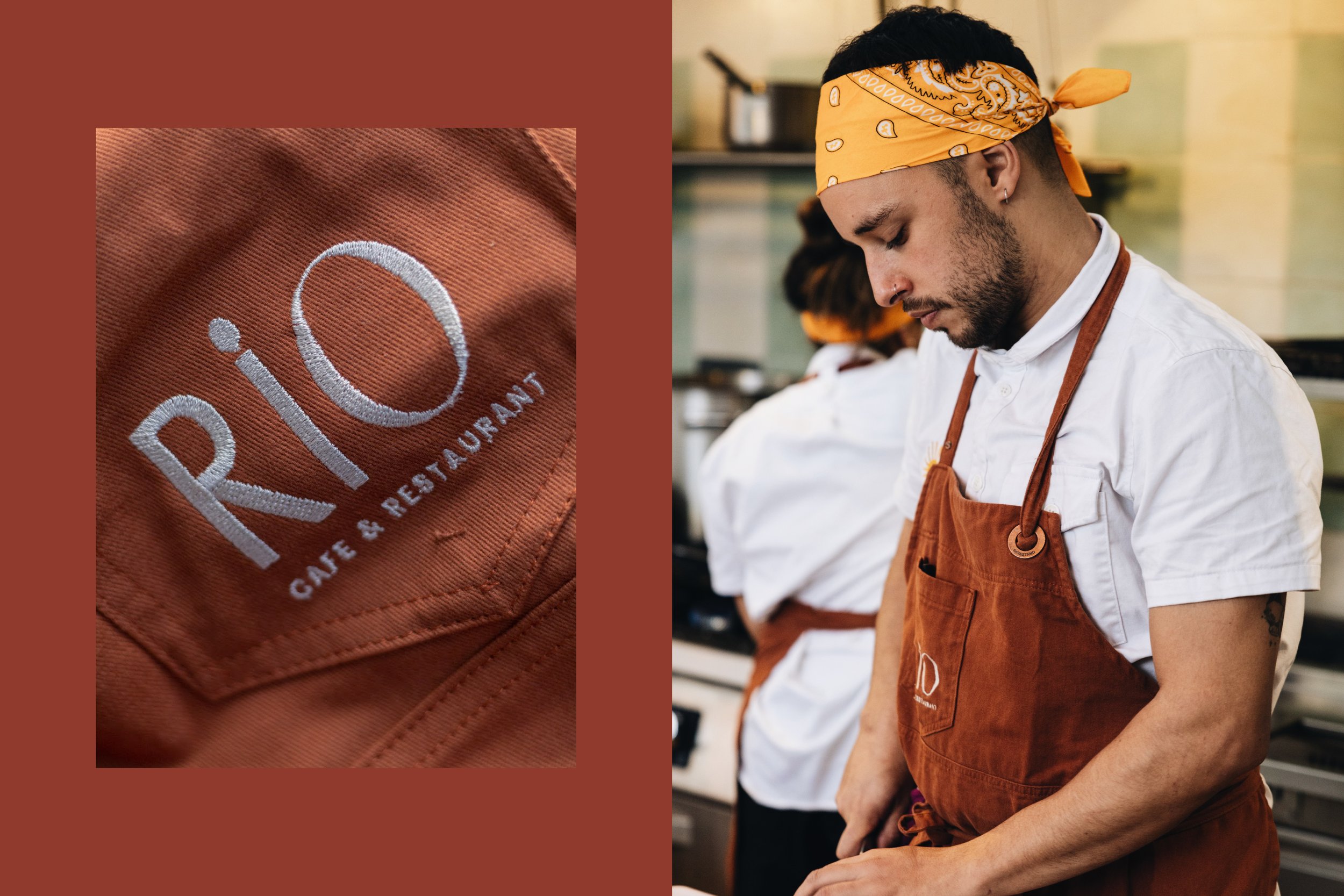
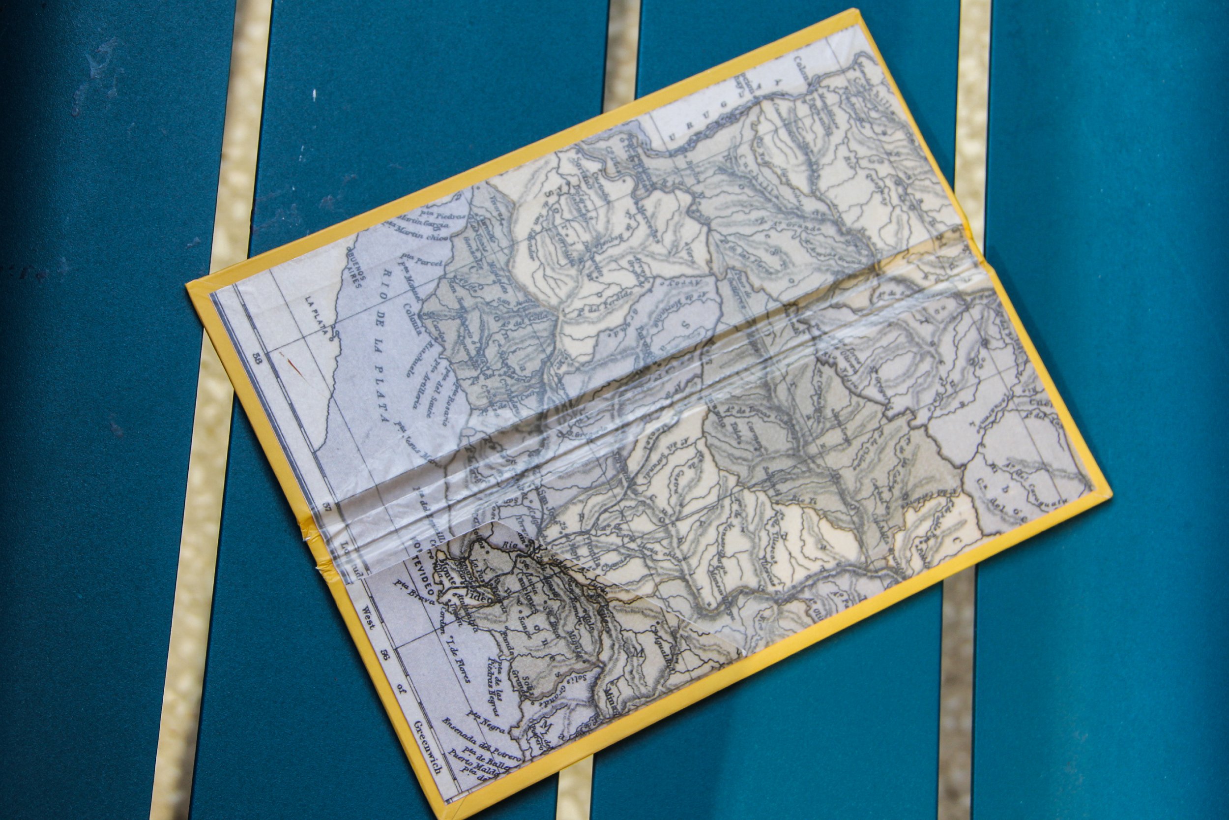
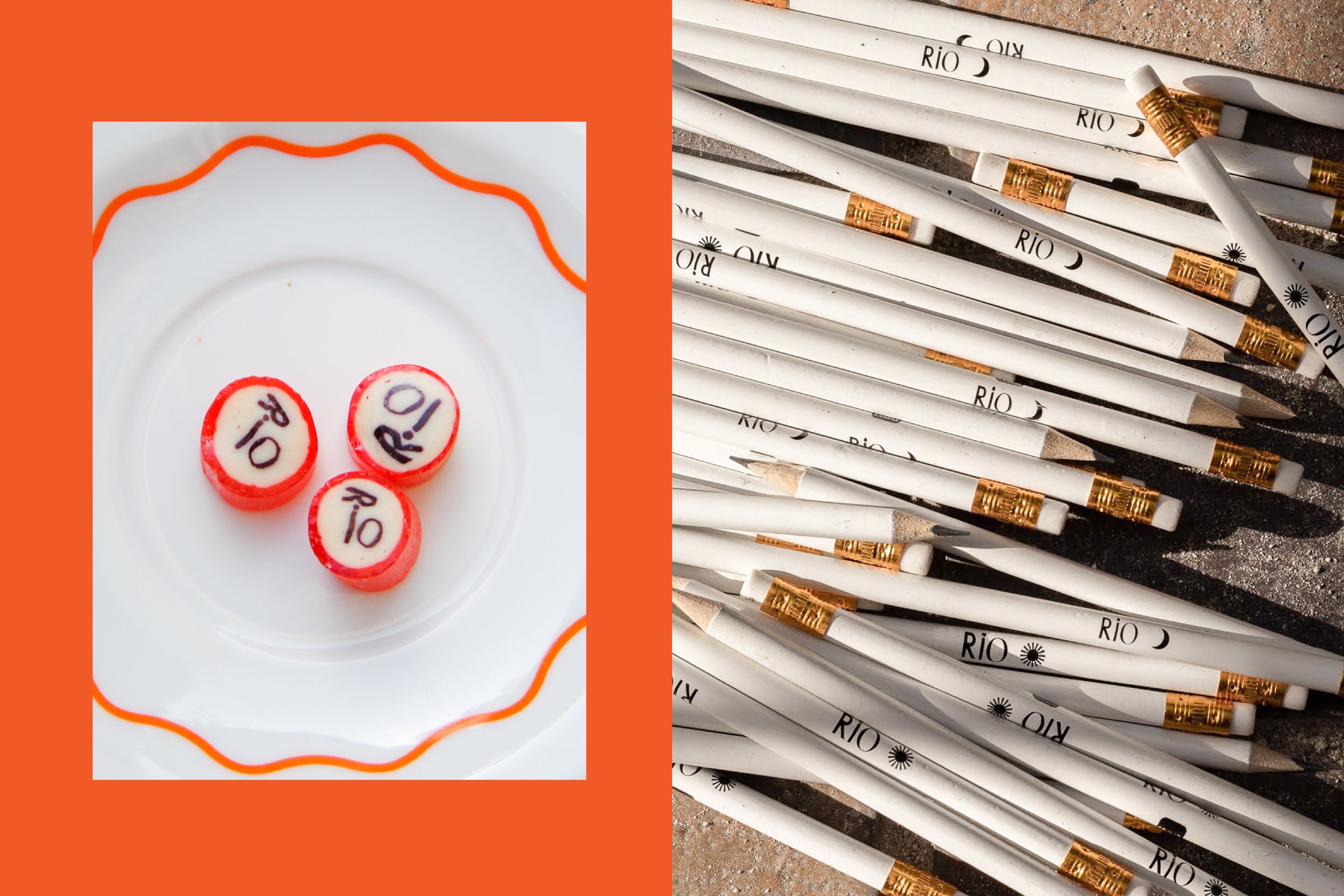
Opened by the team and family behind Montevideo’s well known Manzanar, Rio’s name and identity envolved from both Rio de la Plata, the large body of water that separates Buenos Aires from Montevideo, as well as (yo) “rίo” which translates to laughter (“i laugh”). Our visual design is an homage to both the river that flows through Montevideo, and represents 20% of the country, and the laughter, positivity, and joy that flow through Uruguayan veins, characterizing the country’s culture and people.
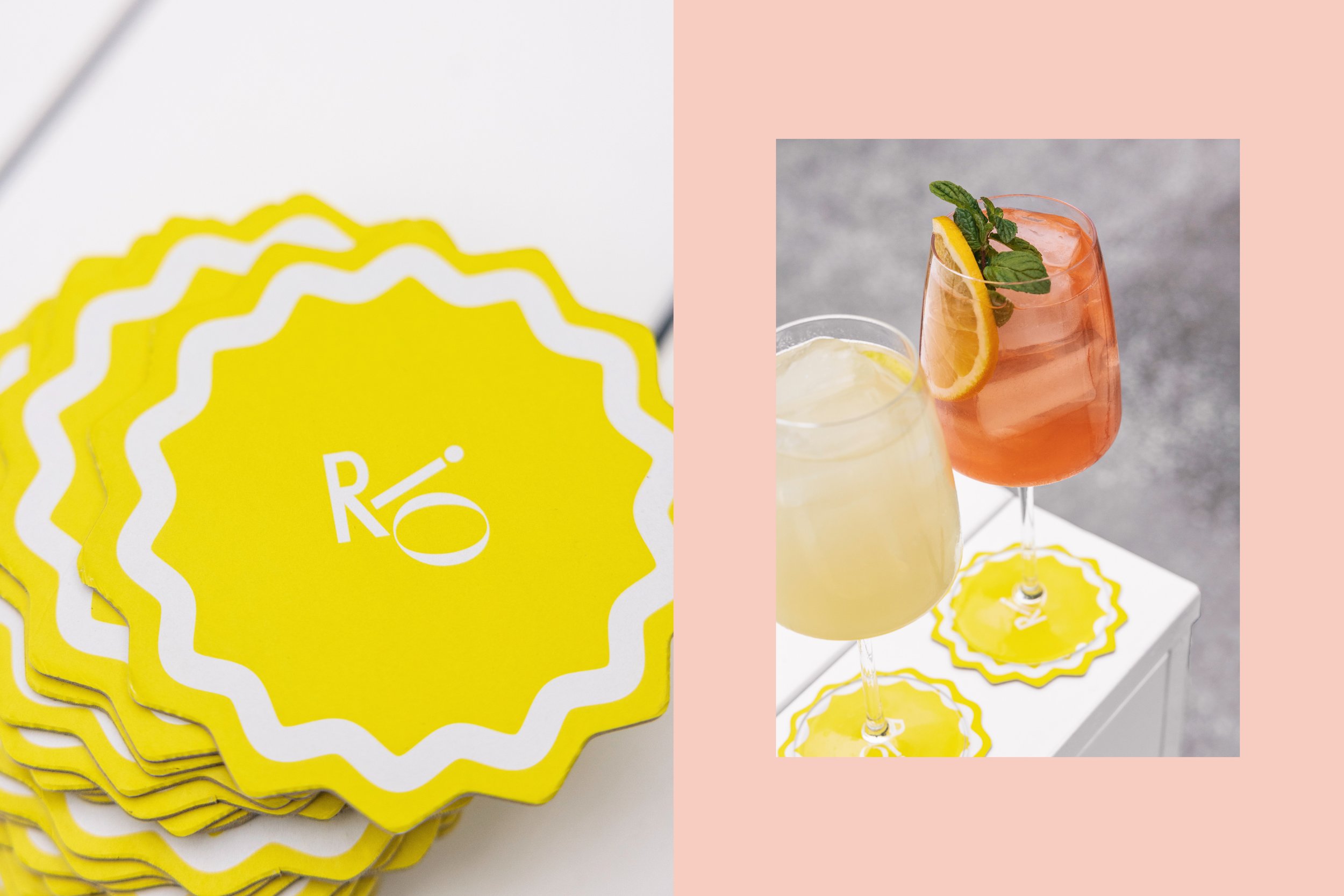
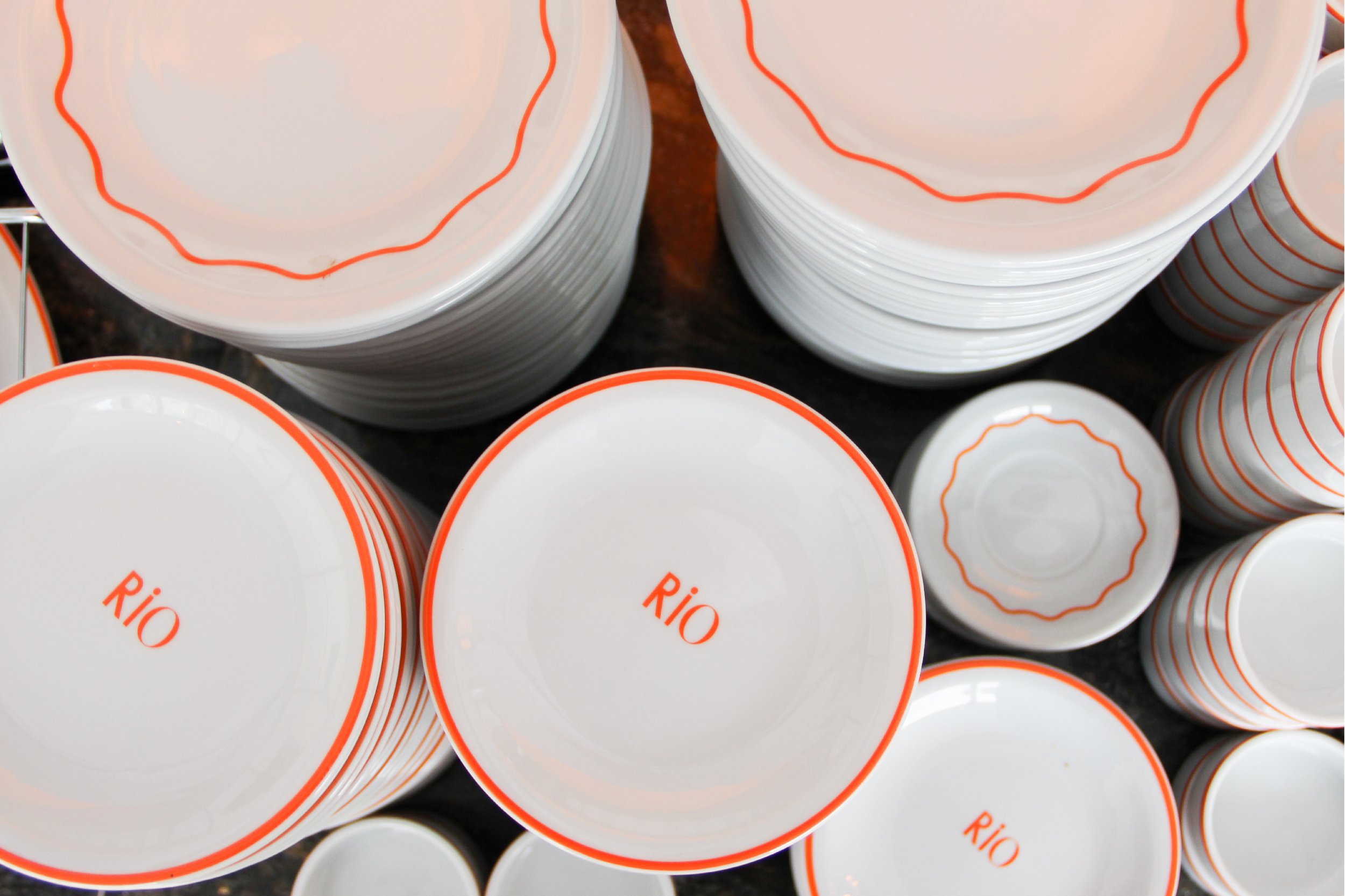
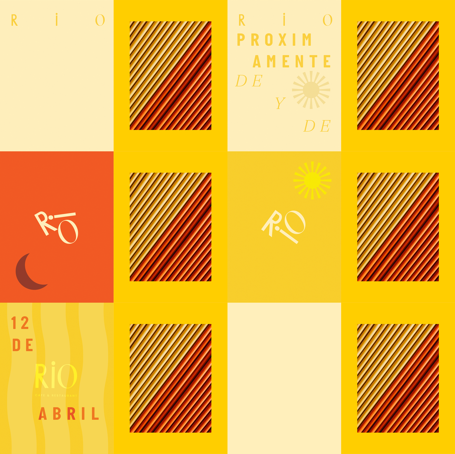
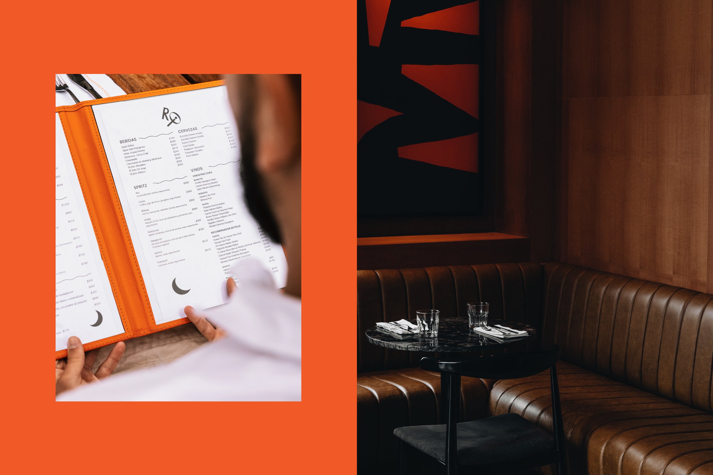
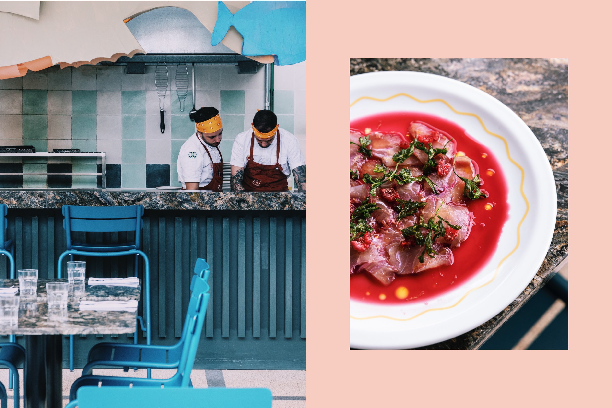
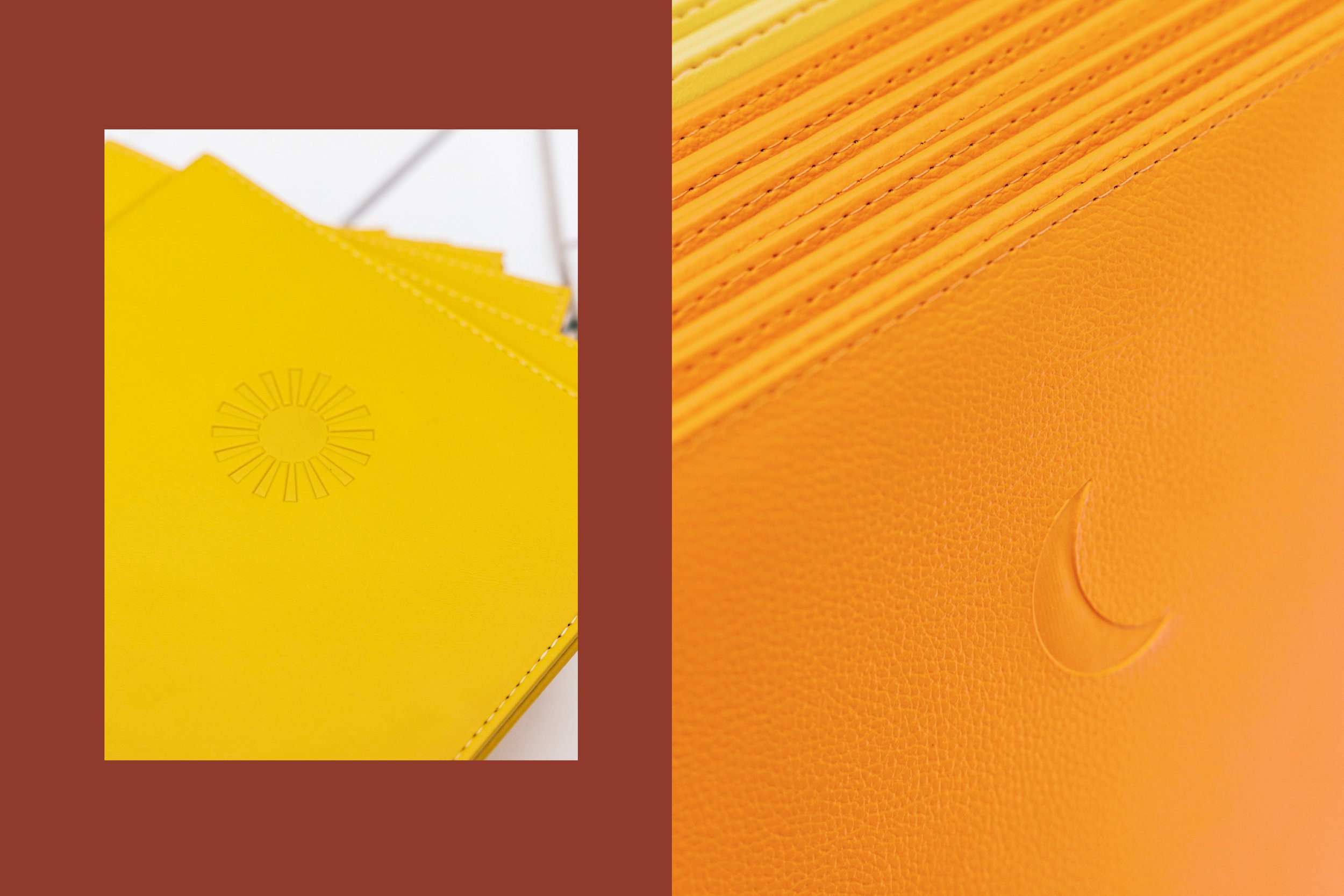
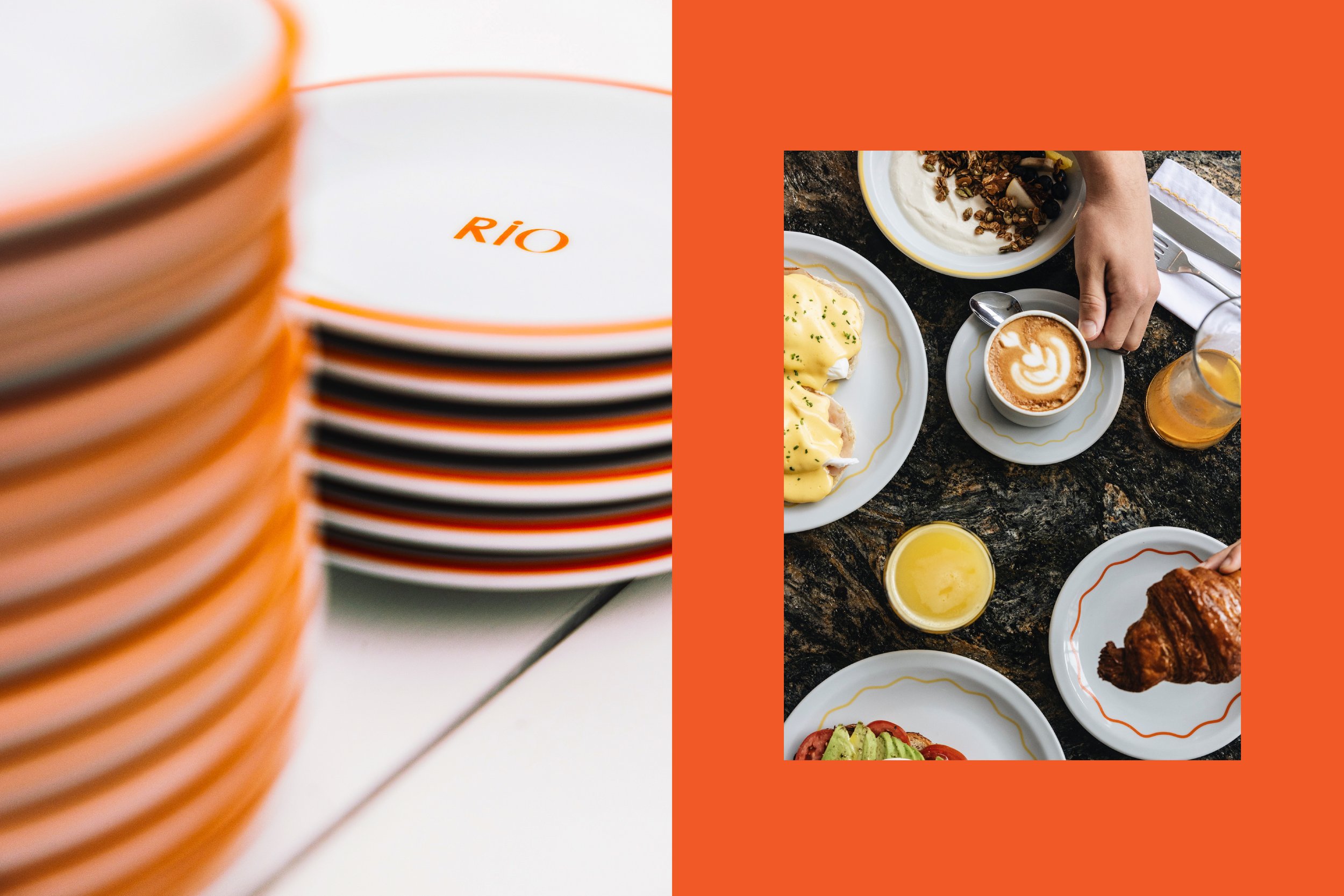
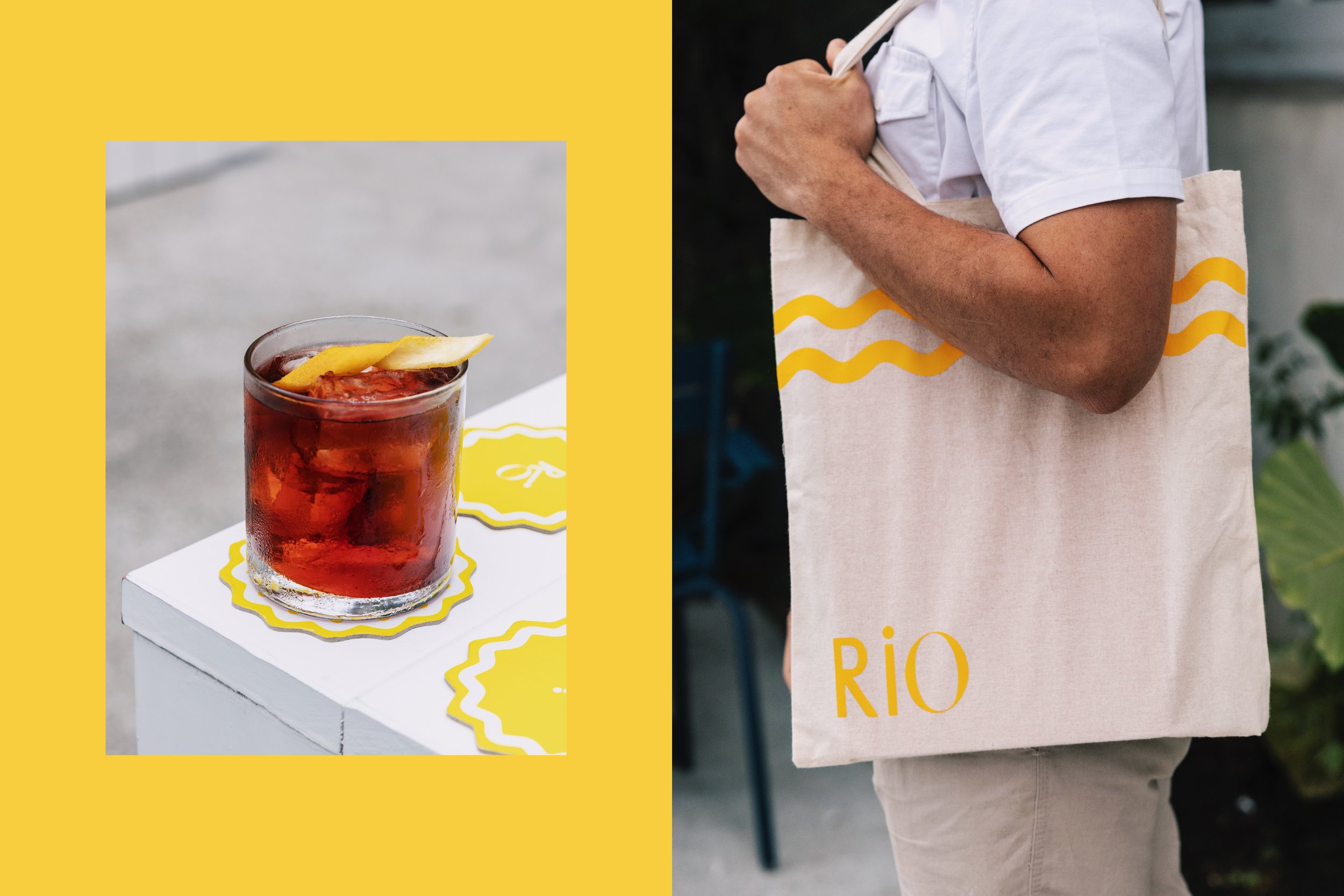
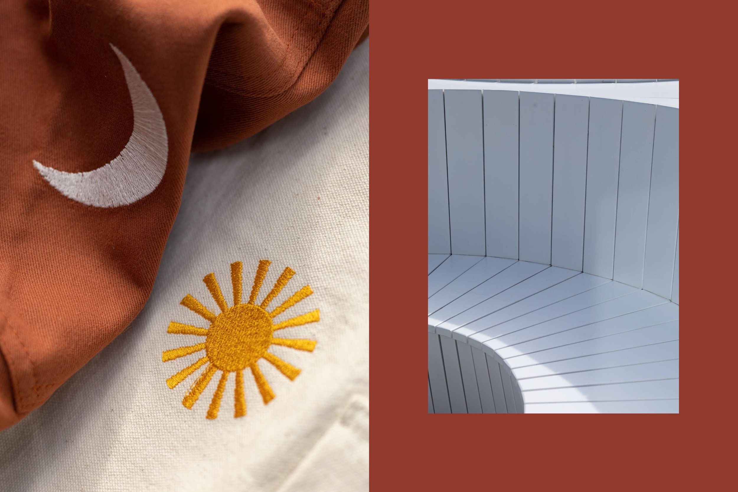
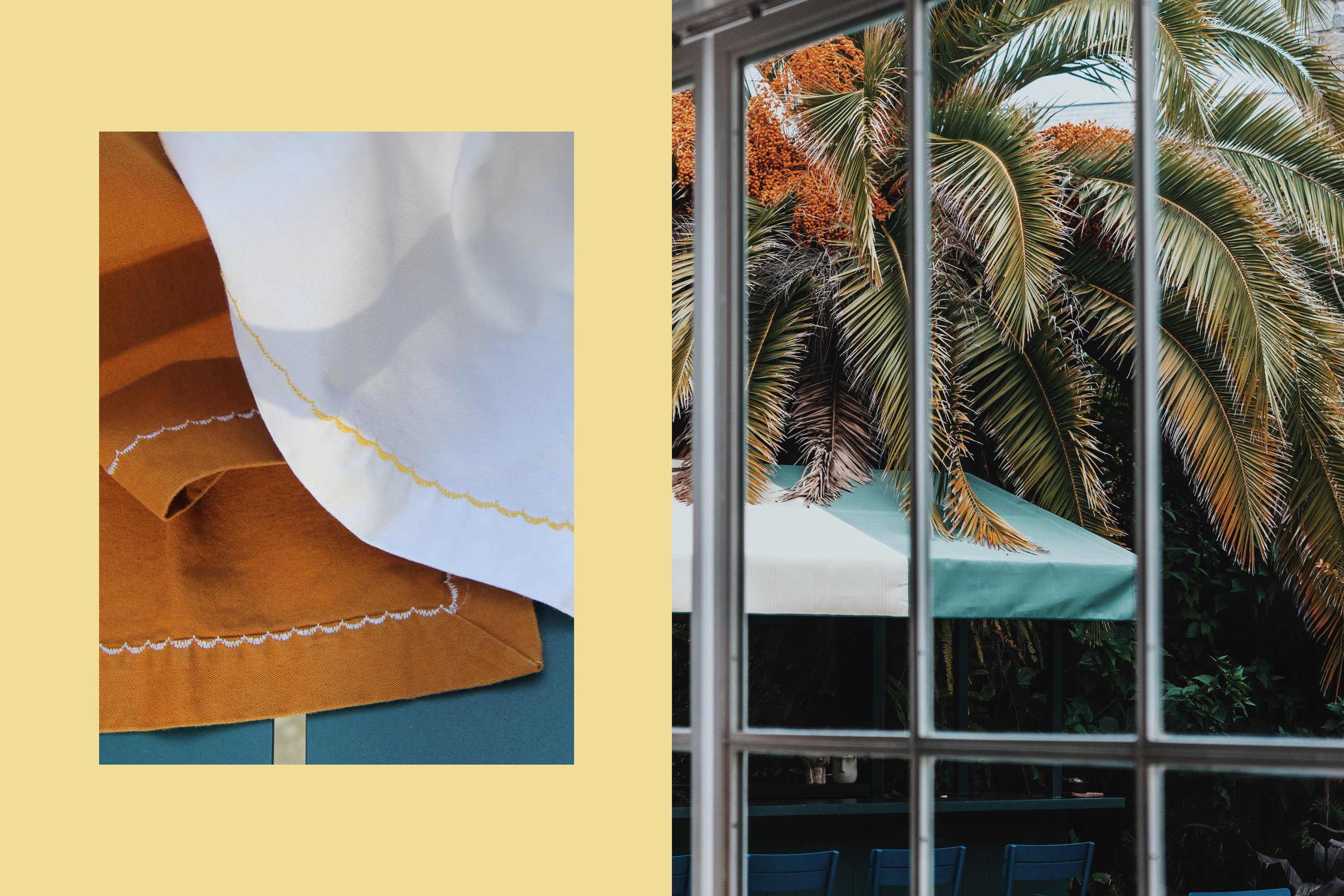
The bespoke logo we selected, and its fluid nature, as well as having various iterations, is inspired by the river’s forward-moving organic flow. In looking through archives of Uruguayan graphic design, we found abundance, joy, and vibrant colors. To emulate Rio’s evolving nature from morning to night, we created time-specific colors and imagery to mark the passing of time visually and create an ever-changing ambiance. A recurring motif are wavy lines of various thicknesses, at times very discrete and at times bolder, changing freely like the tides of Rio de la Plata.
Creative Direction: Polonsky & Friends
Graphic Design: Claire Dufournier
